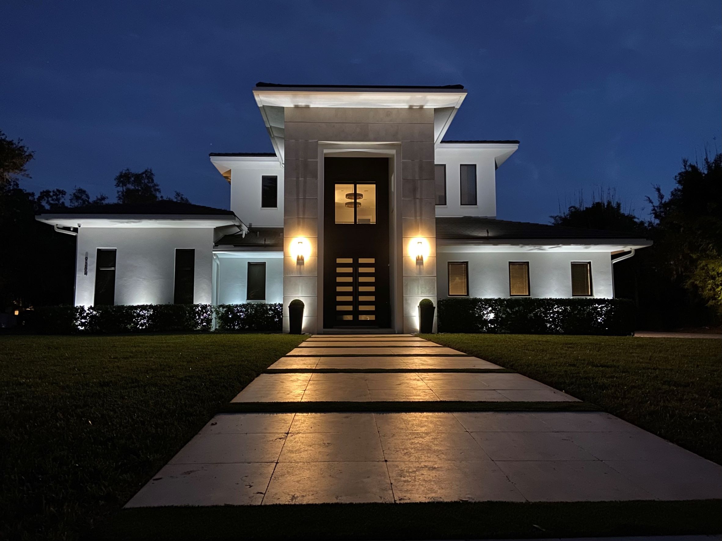
How to Properly Illuminate Coastal Modern Architecture
Coastal Modern architecture takes the sleek, intentional absence of minimalism and warms it with cool tones and natural elements. Homes in this category are characterized by soaring entrances, sharp geometric lines, and colors across the white and gray spectrum. At first glance they seem easy enough to illuminate. In reality, the coastal modern requires a landscape lighting designer to use different techniques.
A White Wall Is a Great Equalizer
If you ask 10 different designers what a cool Kelvin-temperature bulb looks like on white, you’ll get 10 different answers. Some say it looks blue when applied to a white wall and others say it is too bright to use. The truth is that every subject is different and depends on texture, adjacent colors, and underlying paint tones.
For our project, we skipped the guesswork and went to a customizable bulb that allowed us to adjust temperature along the white spectrum, from very warm (2200 Kelvin) up to very cool (6900 Kelvin). Typical cool temperature bulbs are around the 5700 Kelvin mark. To our client’s eye, 5700 Kelvin was not aesthetically pleasing. The color he liked best was 6700 Kelvin.
It Actually Is Brighter
When you apply white light to a beige wall, the result is modestly warm. When you apply white light to a white wall, the result is overly bright. Therein lies the problem with cool temperature bulbs that cannot be dimmed at the lamp. They will almost always be too bright.
By using a customizable LED bulb, we were able to control light output at each lamp. For our project, eight fixtures along the lower-level use 45% light intensity to keep them from being too bright against the first story. Two fixtures at the columns use 85% light intensity to ensure they reach the full height of the entrance. Finally, two fixtures mounted at the second story roof-line use 75% light intensity to adjust for distance from the wall. Not a single bulb is set at the 100% mark.
There’s No Where to Hide
When designing for architecture with wide walls and lack of texture in stonework or siding, any light applied is going to be sharp. Designers should be conscious of how applied light affects the overall color. White subject matter with too much light intensity will be too bright. White subject matter with a standard warm (2700 Kelvin) bulb will look yellow. Grays act the same way, easily becoming too stark or too dull if not customized. Talk to your designer about the specifics of your project and ask about a customizable bulb if your property falls into the new category of Coastal Modern. Know that a customizable bulb will cost more on the front end but will deliver the results needed for the color palette.